

The Power of Nothing: Why Peter Saville’s Record Covers Are Impossible to Ignore
The legendary graphic designer behind Joy Division and New Order explains how mastering empty space shaped some of the most iconic album art in music history.

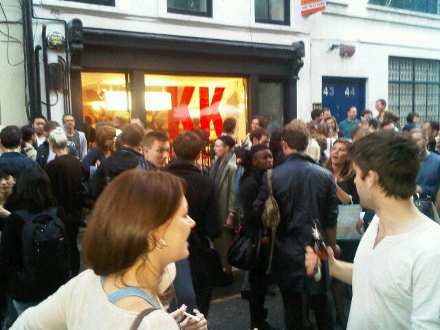
Many years before this Substack, I founded and edited an arts and culture publication called Afterzine. Published from my Brooklyn apartment—and stored under the table in my Vanity Fair office—it was printed in an initial run of 1,000 copies. Thanks to a lot of incredibly supportive stores—Colette in Paris, Opening Ceremony and McNally Jackson in Manhattan, KK Outlet in London, Papercup in Beirut, and Skylight in Los Angeles, to name a few—the entire run sold out in a couple of months.
Over the subsequent 18 months I put out three issues, with contributions from the likes of Thurston Moore, Peter Mendelsund, Tavi Gevinson, Emma Straub, Robert Montgomery, Zooey Deschanel, Theodora Allen, Andi Teran, and many more.
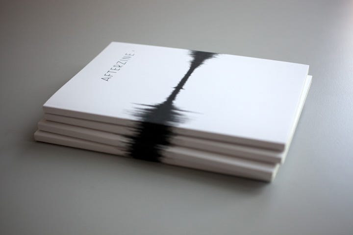
As all three issues were print-only, much of Afterzine’s content has never been published online—and much of it never in color, until now. Over the coming months, I’ll select a handful of archive features to share here as Octet subscriber bonus content, starting today with an interview from 2010. Here, my good friend Laura Havlin speaks with legendary British graphic designer Peter Saville about the theme for issue one: Negative Space.
Peter Saville Considers Negative Space
As told to Laura Havlin
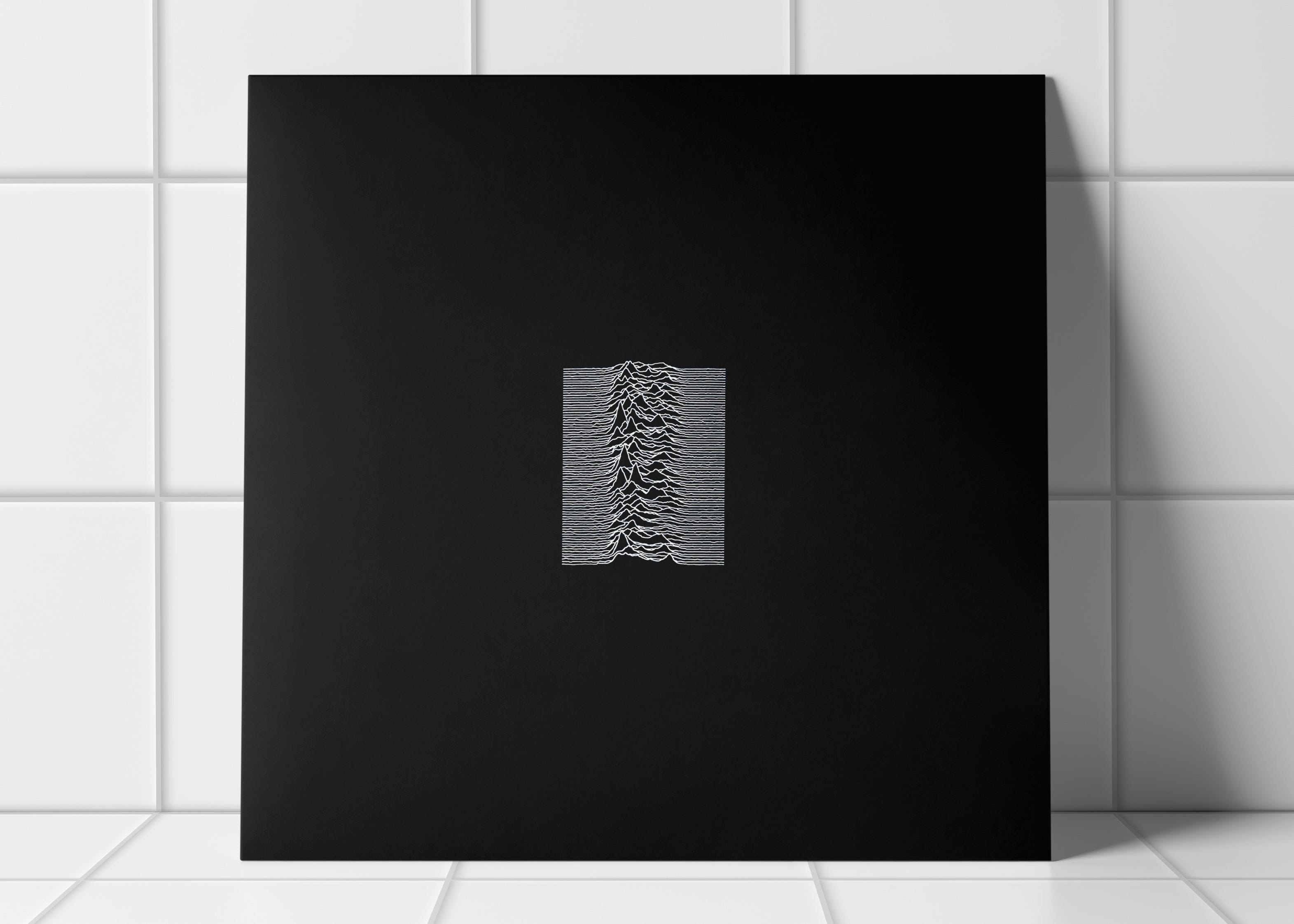
Art director Peter Saville made a name for himself in the Manchester music scene of the late 1970s and early 1980s, creating some of the most recognizable record covers of all time, designing now iconic sleeves for Joy Division and New Order among others. Since 2004 Saville has served as creative director to his hometown of Manchester, England, performing a service that led curator Hans-Ulrich Obrist to define him as a “social sculptor.”
From album art to fashion and consulting collaborations, his work has been characterized by its brave use of empty, clean spaces. Talking to Laura Havlin, Saville explores the significance and the power of negative space, and postulates what it has come to represent on a broader scale.
There is an active awareness of negative space in the context of graphics. It’s such a known value or quality that it’s more of an intuitive thing with graphic designers so it is most likely to be referred to in passing in a kind of “well of course” way.
Keep reading with a 7-day free trial
Subscribe to The Octet to keep reading this post and get 7 days of free access to the full post archives.